TailwindCSS 上下左右中央の配置方法を場面別に解説。flex justify-center items-center が効かない、画面の中央に固定できないなどの悩みを持つ方へ、実例付きで紹介します。

Contents
はじめに
TailwindCSS 上下左右中央、どう配置すればいいか迷っていませんか?
「justify-center items-center を書いたのに上下中央にならない」「画面の中央に固定したいのにズレる」——そんな経験はありませんか?
実は、上下左右中央には場面ごとに適切な組み合わせがあります。今回は、よく使う3つのテクニックを紹介します。
私の体験談
その前に、私の体験談を少しだけ聞いてください。
私も最初、TailwindCSSの配置でめちゃくちゃ苦労しました。
特にモーダルやダイアログを画面の中央に置きたいのに、全然うまくいかない。justify-center items-center を書いてるのに、なぜか中央にならない。
これも結局、有識者のコードを見て「あ、こう書くんだ」と後から理解した感じです。
そんな遠回りは、私だけで十分。この記事が誰かの近道になれば嬉しいです。
テクニック1: Flexboxで上下左右中央
コンテナ内で要素を上下左右中央に配置したいとき、flex justify-center items-center と高さ指定を使います。
読者Aさんの誤解
- 公式ドキュメントの Justify Content ページを開く
https://tailwindcss.com/docs/justify-content - 「
justify-center→ 中央に配置」と書いてある - Align Items ページも確認
https://tailwindcss.com/docs/align-items - 「
items-center→ 垂直方向も中央」と書いてある flex justify-center items-centerを付けてみる- ...水平は中央になったけど、垂直が中央にならない
- 「両方書いてるのに、なんで上下中央にならないの...?」
コード例
NG: flex justify-center items-center だけ
<div class="bg-slate-700 p-8">
  <div class="flex justify-center items-center bg-white rounded-lg">
    <div class="bg-blue-500 text-white px-4 py-2 rounded">中央に配置</div>
  </div>
</div>
OK: flex justify-center items-center + 高さ指定
<div class="bg-slate-700 p-8">
  <div class="flex justify-center items-center h-48 bg-white rounded-lg">
    <div class="bg-blue-500 text-white px-4 py-2 rounded">中央に配置</div>
  </div>
</div>
解説
items-center が効くには親要素に高さが必要です。高さがないと垂直方向の「中央」が存在しません。
ポイント
Flexboxで上下左右中央にしたいときは、flex justify-center items-center + 高さ指定を使いましょう。
テクニック2: Gridで上下左右中央
Gridを使うと、1つのクラスで上下左右中央を実現できます。
読者Bさんの誤解
- 公式ドキュメントの Place Items ページを開く
https://tailwindcss.com/docs/place-items - 「
place-items-center→ 中央に配置」と書いてある - 「1つのクラスで上下左右中央にできるんだ!」
place-items-centerだけ付けてみる- ...垂直方向が中央にならない。上のまま
- 「中央に配置って書いてあるのに...?」
コード例
NG: place-items-center だけ
<div class="bg-slate-700 p-8">
  <div class="place-items-center h-48 bg-white rounded-lg">
    <div class="bg-blue-500 text-white px-4 py-2 rounded">中央に配置</div>
  </div>
</div>
OK: grid place-items-center + 高さ指定
<div class="bg-slate-700 p-8">
  <div class="grid place-items-center h-48 bg-white rounded-lg">
    <div class="bg-blue-500 text-white px-4 py-2 rounded">中央に配置</div>
  </div>
</div>
解説
place-items-center は Grid 専用のクラスです。grid とセットで使わないと効きません。
ポイント
Gridで上下左右中央にしたいときは、grid place-items-center + 高さ指定を使いましょう。
テクニック3: 画面の中央に固定する
モーダルなど、画面(ビューポート)の中央に固定したいとき、fixed を使います。
読者Cさんの誤解
- モーダルを画面の中央に表示したい
absoluteで中央配置を試みる- ...スクロールすると位置がズレる
- 「画面の中央に固定したいのに...」
コード例
NG: absolute を使用
<div class="bg-slate-700 p-8 h-96">
  <div class="absolute inset-0 flex justify-center items-center">
    <div class="bg-white rounded-lg p-6">モーダル</div>
  </div>
</div>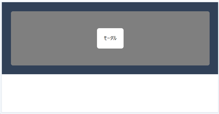
OK: fixed を使用
<div class="bg-slate-700 p-8 h-96">
  <div class="fixed inset-0 flex justify-center items-center">
    <div class="bg-white rounded-lg p-6">モーダル</div>
  </div>
</div>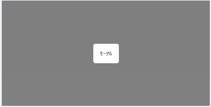
解説
absolute は親要素に対して配置されます。fixed は画面(ビューポート)に対して固定されるので、スクロールしてもズレません。
ポイント
画面の中央に固定したいときは、fixed inset-0 flex justify-center items-center を使いましょう。
まとめ
TailwindCSS 上下左右中央のテクニックを3つ紹介しました。
- コンテナ内で上下左右中央(Flexbox):
flex justify-center items-center+ 高さ指定 - コンテナ内で上下左右中央(Grid):
grid place-items-center+ 高さ指定 - 画面の中央に固定:
fixed inset-0 flex justify-center items-center
場面に応じて適切なクラスを使い分けてみてください。
最初の一歩を踏み出したい方へ
調べても調べても、何が正解かわからない——
WEB系へスキルチェンジするため、TailwindCSSを学び始めた頃の私です。
何から始めればいいのか、見当もつかない。記事を読んでも、情報がバラバラで混乱するばかり。
それでも諦めずに、調べて、手を動かして、試し続けました。
その結果、ようやく見えてきた「最初の一歩」を、この講座にまとめました。
同じ悩みを持つ方へ、最初の一歩を照らすガイドになれば嬉しいです。